Translate

Thursday, December 18, 2014

Ten Questions for Benjamin A Vierling

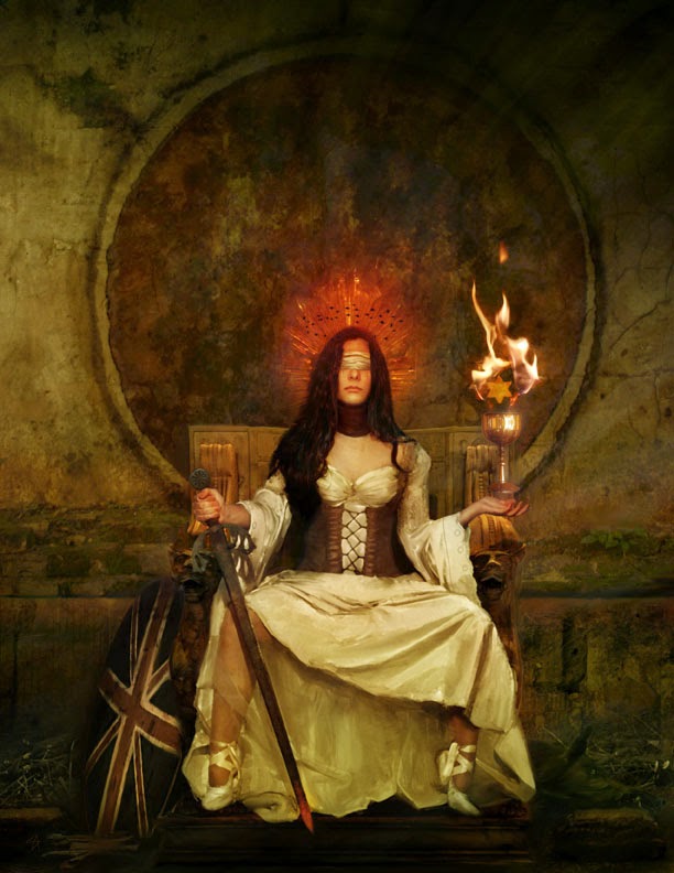
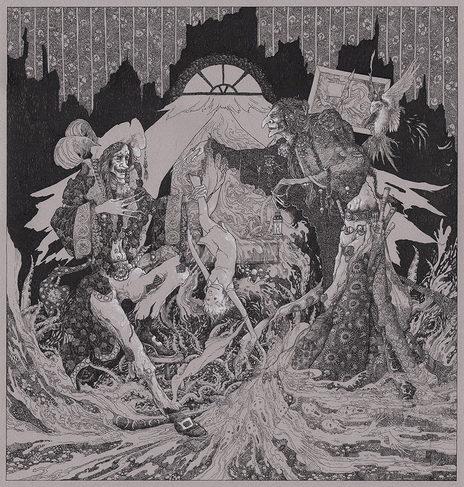
Back in the winter of 2013, my guest curator, Yvette Endrijautzki, informed me that she wanted to squeeze yet another artist into our "Chamber of Wonders" show, which was now mounting into a massive group show consisting of over 56 pieces by 40+ artists. I started to protest - this show was starting to become a cataloging nightmare - but she insisted this artist had something special to bring to the table. She then showed me the painting entitled Papaver Somniferum, and I readily agreed with her.
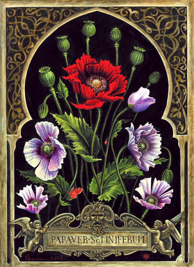
Papaver Somniferum
I think what immediately struck me with Benjamin's work was the pure chroma from his primary colors, which was very reminiscent of early tempera paintings I had seen in Florence and Vienna. Tempera is a paint with a binder of egg whites: it dries very fast and leaves behind very deep coloring rarely seen by other binders. Used by early European painters prior to the discovery of oil mediums, the colors were very intense and vibrant.
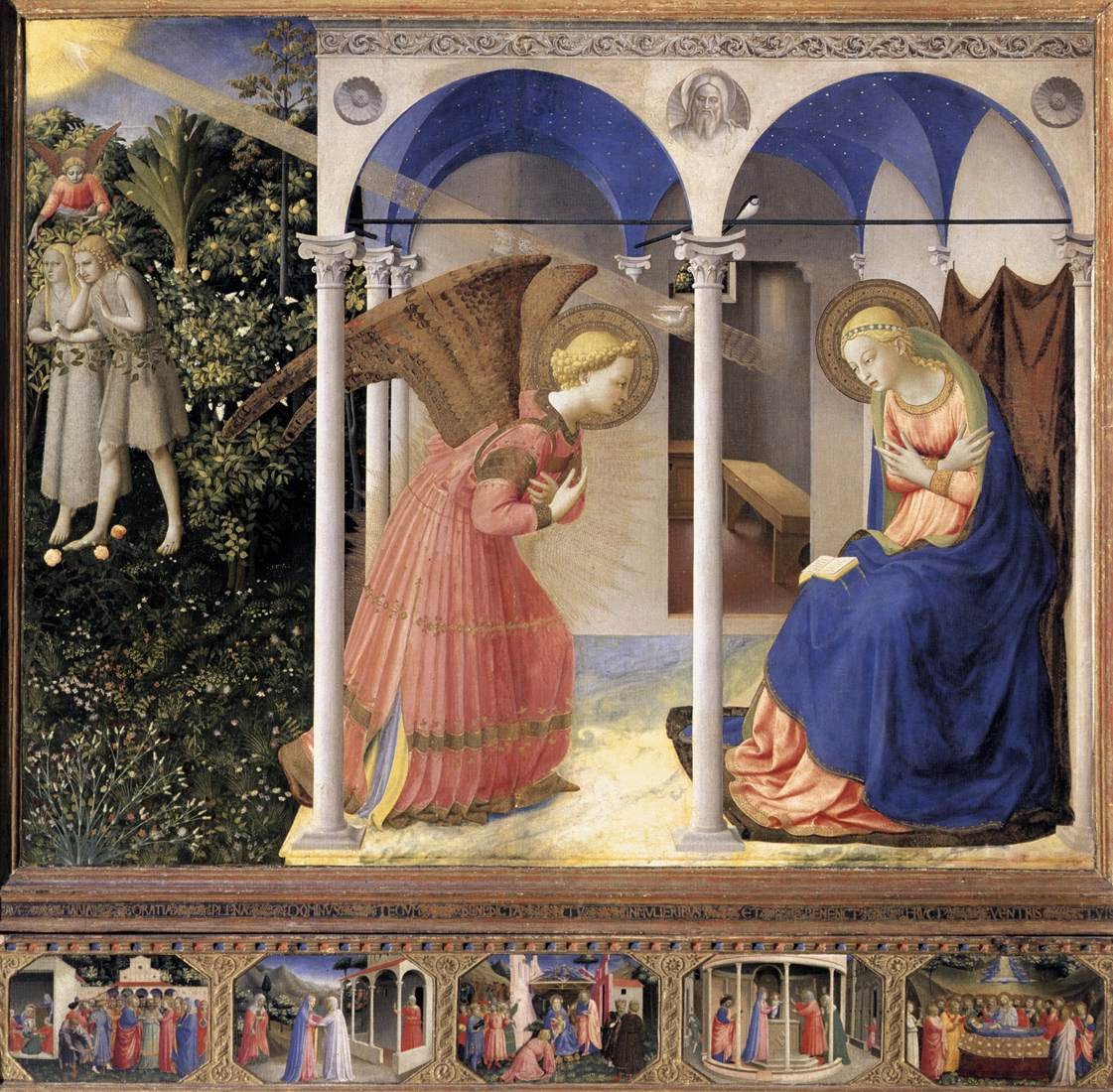
The Annunciation, a 15th C tempera painting by Fra Angelico of Florence
Benjamin works in tempera, oil, inks and polymer pigment, creating pieces of art that immediately transport you back in time, although his content isn't always archaic. He uses a form of the momento mori (or still life) in nearly all his pieces, freezing his subjects in a place within time, giving the viewer a moment to observe, with relative leisure, every finite detail he has chosen to render. His lighting is stark and artificial, enhancing that sense of timelessness.

Since I first saw his work last year, I have since followed up on this remarkable painter and have happily represented his work. Since he is not local to Seattle, I only saw it fit to ask him to answer Ten Questions so our visitors and collectors can learn a little bit more about Benjamin. Here's what he had to say!


1. Please give a little information on your background: what school did you attend, your inspirations for the direction you've gone, if and where you've taught.

My schooling has come primarily from individuals, books, museums, apprenticeship scenarios, and otherwise unique circumstances. I was always enamored of the Old Masters, and had the good fortune to grow up in an environment where I could immerse myself in tomes featuring Rembrandt, Goya, and Dürer. Living in proximity to the San Francisco Bay Area also facilitated contact with cultural and artistic experiences that illuminated my understanding of aesthetics in general.

 As a youth I studied for a few years with a painter in rural northern California who taught me the rudimentary fundamentals of oil painting. She was essentially a fauvist who crafted enormous, colorful canvases of an expressionistic nature, but she had a solid understanding of classical techniques, and imparted these principles to me. Her philosophy, which I agree with to this day, was that a  painter should know how to render form, color, and light with some accuracy, regardless of the stylistic direction ultimately taken.

The value of studying the great paintings in the world's museums should not be underestimated, and a large part of my understanding of composition and rendering has come from simply viewing and contemplating the great works. Visiting regional art museums is always a priority when I travel, and decades of wandering has enabled me to see some exceptional masterpieces in person. The modern era is unique in that so many unique treasures from all times are available for us to study and reflect on. Even small local museums often house gems to inspire and enchant. There is an anonymous victorian Madonna hanging in the foyer of the cultural center where I have my studio for instance, and her consolatory gaze still captivates me every time I pass through. 
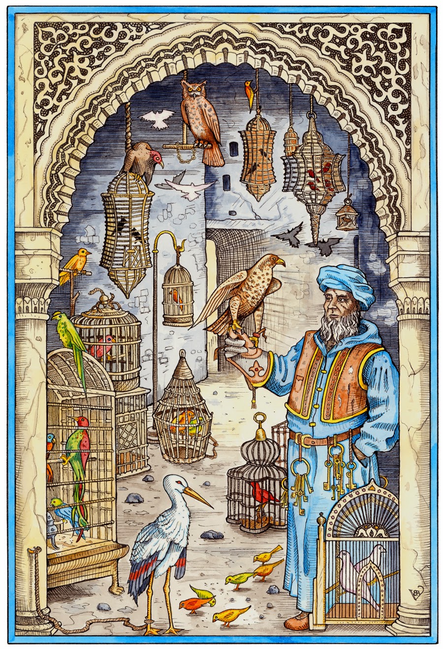
Fantastical Aviary
I don't have a lot of experience teaching, although I have lectured at the Gage Academy of Art in Seattle, and co-facilitate a life drawing group in the northern California town where I live. While I have spent a lot of time studying & painting, my own methods of creation are ultimately somewhat erratic and intuitive, making literal transcription a challenge. My strengths as a guide through the creative labyrinth lie more in conceptual theories surrounding aesthetics in general, and in exploring the repetition of archetypal motifs throughout the history of Art. 


2. Explain your method of painting, especially with tempera. Did you develop this method on your own, or learn it?

I studied the traditional 'Misch' technique with Professor Rubinov Jacobson in the Austrian Alps. Jacobson is the foremost pupil of the renown Fantastical Realist, Ernst Fuchs, and he teaches the mixed media technique of working with egg tempera and oil on panel, in the manner employed by painters of the early renaissance. The method involves extensive use of subtle oil glazes over a monochrome tempera underpainting, and typically requires some months to bring to completion. When utilized correctly, the process evokes unrivaled effects of light and shadow, emboldens colors, and enriches the illusory nuances of dimensional space.
Firebird
I've experimented with the particulars of the technique, but more or less employ it as it was taught to me. It's a chemically delicate procedure, as the water based egg tempera must be carefully layered with the oil based glazes in order to prevent cracking and melting. The fundamental  principles can be applied to other media of course, and my process tends to involve a gradual building of forms through layering effects, even when employing polymer pigments or inks. I do a lot of work with ink and gouache on toned paper, and this style also reflects the aesthetic of the renaissance and early baroque periods which so fascinate me.

3. Your imagery hearkens to a period of late Medieval/early Renaissance symbolic work, especially of the Italian, Dutch and Flemish style. What is the draw to this type of symbolism in your compositions?

It's interesting to reflect on the Proteus that kindles the flames of devotion, compelling one to embark on a specific path. I could certainly cite numerous occasions when I was deeply moved by a particular work, or found myself confronted with an aesthetic experience that reinforced these inclinations. Traveling in Europe, spending time immersed in archaic books and staring for hours at the works of the great masters in cavernous museums has undoubtedly validated my field of interest, but it's often the quietly intimate notes that speak with the most resonance.

I remember that as a boy, my father has a large framed lithograph of Pieter Bruegel's painting, The Hunters in the Snow, hanging in his San Francisco flat. Whenever I visited him there, I would sleep under that image and watch the scene darken as twilight settled over the city outside, and then witness it come to life again when the dawn expanded into day. I marveled at the vision of these struggling, umber hued figures, plodding grimly through layers of ice towards the village in the valley below, all framed by the dark clutching limbs of naked oaks. The remote figures bustling in activity appear as myriad as insects, imparting a perspective of remote detachment which is then confronted with the looming imposition of distant mountain peaks, regal and unyielding. One is both humbled and calmed by the spectacle.
The Hunters in the Snow, Pieter Bruegel
Years later as a young adult, I was confronted with the original painting on my first visit to the Kunsthistoriches Museum in Vienna. I didn't realize that the work was there, and the discovery had a shocking effect. It was not unlike the disorienting experience of waking from a dream to find one's self within that very dream, the reality ultimately being richer, more complex, and more sensually overbearing than one could imagine. I spent some hours in that chamber with this work and all the other Bruegel paintings. They are all remarkable images of course, but years of accumulated memories converged in that one epic vision of the Hunters in the Snow.

To extract greater significance from this anecdotal reflection: It has always been my ambition to create something in which others might also find their own dreams reflected. The early northern renaissance has merely been a snow covered field in which my dreams have struggled, aspired, frolicked and bloomed. 

4. You've done some work in illustration, mostly book and album covers. Do you still do illustration jobs?

Illustration work constitutes the bulk of my creative labor, with applications ranging from album artwork for bands, book covers and illustrative plates, screened posters, and even some film applications. I always render everything by hand in traditional media, though the application may often times be exclusively for print. I never really thought of myself as strictly an 'Illustrator' in a literal sense, as my springboard has always been the tradition of painting. I nevertheless approach commercial commissions and collaborations with the same devotion that I apply to my personally inspired works.
 
The Devil's Fractal. Avichi. Profound Lore Records 2011
Interestingly, the lines between fine art and illustration have become blurred in the recent decades, as they were in the 19th century, when image-craft was exalted by cultural institutions, and engravings and prints were given status with salon exhibitions. Most of my favorite artists from history all embraced printmaking, took commissions, and otherwise encouraged the popularization of their images to substantiate and fund their careers. In this sense, 'Art' becomes more of an aesthetic outpouring, taking a myriad of forms, and illustrations are certainly one of these guises.

To my observation, current cultural values have been shifting back towards an appreciation of handcraft and artisan labors, which bodes well for artists who bridge form and function with their endeavors. It's important to produce work that everyone and anyone can appreciate, so while I value the meditative intimacy of gallery viewing, I also strive to create work that people can live with, and perhaps even be inspired by. Prints, book illustrations, and album covers obviously facilitate a more direct point of contact for the average person who is not a collector, or who maybe never steps inside a gallery space. A significant aesthetic experience can still come through humble methods.

5. Do you feel there is an element of art training that new artists and illustrators are missing or should concentrate on these days?

This is a complex query and I believe that it's important to have some objectivity regarding the field of illustration in general, and what it means to be a crafter of imagery in the 21st century. Digital media is clearly without rival in the field of popular illustration, and anyone seeking to be competitive in this arena would benefit from substantiating their computer skills. Despite this acknowledgment, I don't create any digital imagery myself, so my perspective may be somewhat skewed. My own aesthetic values tend toward the archaic, and I exalt in the quiet simplicity of a blank piece of paper and a stick of graphite. I'm not a Luddite however, and I do frequently use the computer to assist with some types of composition layout, with transferring sketches to larger format panels, and with preparing image files for print.

The internet is obviously invaluable for promotion and also for research, particularly when referencing obscure niches of art history. We are extremely privileged to have access to virtually all images from all times, though with the increased  accessibility comes the added challenge of reinterpreting ancient material to a novel and relevant contemporary effect. In some ways the illustration field is more competitive than ever before. There are so many talented and devoted artists working right now. Establishing a strong artistic identity is paramount, as is the understanding the lengthy tradition of illustration throughout history, and how it has evolved and shifted over time.

6. Do you have a particular dream project you are working on or would like to work on?

Yes indeed, all my efforts in the studio are currently being applied to a monumental illustration project for Daniel Schulke, which concerns the spiritual and magical properties of plants; a time-honored Herbal of the highest order, uniquely composed for the 21st century. The images  themselves are very much informed by an extensive tradition of botanical illustration, an endeavor that has necessitated a tremendous amount of research on my part. It has been imperative that I not only familiarize myself with the physical attributes of the individual plant species, but also with the various visual interpretations that have come before. The goal is to elaborate on this rich tradition of illustration in a unique and original manner, whilst giving particular attention to the intangible presence of each individual plant. Woven throughout are decorative elements and narrative compositions that provide a window into the many diverse legends and myths that pervade the plant kingdom.
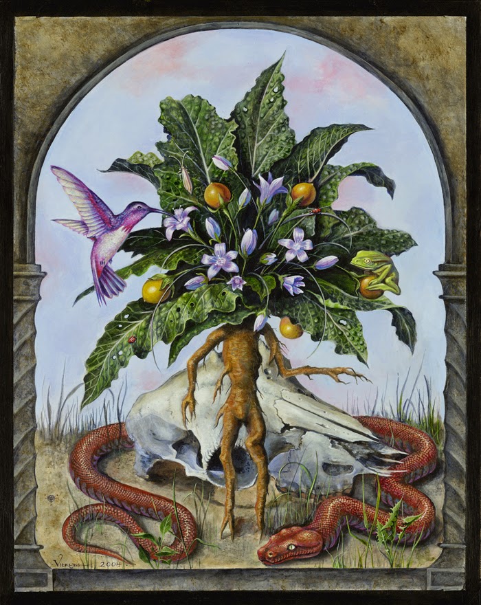
Mandrake
I previously collaborated with Schulke on his seminal work, Veneficium, a book which explores the historical connections between poison and witchcraft, and was released by Three Hands Press, a publisher renown for beautifully lavish productions of esoteric tomes. The scope of this current botanically themed project has been all consuming since I began work on it in 2011. Schulke's text, informed by his experience as a practicing herbalist, both for clinical and occult applications, contains 25 years of original research into some of the most obscure aspects of herbs, particularly their magical natures as it intercepts human magical experience. The book will be about 700 pages in total, will feature hundreds of individual illustrations all hand rendered by me, and is scheduled for a 2016 release.


As for a total dream project: I would eagerly embrace the opportunity to do an official, state-sponsored painted portrait of any one of the currently most influential world leaders, provided that I was able to compile all the reference material myself and to depict the sitter as I deemed appropriate. A lavish fantasy perhaps, but one must at least imagine the possibilities….

7. Does literature inspire your work?

Literature doesn't necessarily inform my compositions, unless it is indirectly through a mythological subtext. I strive to evoke timeless themes and iconographic subjects, often looking to the classical pantheon to substantiate my concepts. In keeping with the aesthetic traditions that inspire my work, such as the German Romantic painters and Fin de siècle Symbolists, the narratives behind my work tend to synthesize deeply personal experience with an archetypal mythos.

8. Which contemporary artist currently inspires you and why?

I am primarily inspired by the work of my peers; those creative individuals who vigilantly tend to the creative flames, and who offer their unique visions to the world. Longtime friends and colleagues, Madeline von Foerster and David D'Andrea are particularly motivating, and I have been privileged to watch their creative careers develop & blossom over the past few decades. We all came out of the same underground cultural context in the early 1990's, and share similar aesthetic values, inspired by the natural world, art history, and the craft of obsessive rendering. I have been privileged to meet, and exhibit with a lot of other remarkable artists over the years, a complete list of whom is too lengthy to convey here, but Yvette Endrijautzki, Steven Kenny, Rose Freymuth Frazier, and Denis Forkas all come to mind - Artists who are doing unique and exceptional work.
Pangolin, Madeline von Foerster
As a painter I'm naturally enamored of Odd Nerdum, who has really established a revival of archaic techniques and timeless compositions. Nerdum's oft extremist stance on contemporary Art, and his adherence to what he terms 'Kitsch Painting', has provided an entire generation with a strong precedent to substantiate the pursuit of a more traditional mode of painting.

I'm also moved by the work of some close friends who are not commercial artists, but who nevertheless exalt in the nuances of color, form and light, and who express the depths of the human experience with the passionate use of pigment and line. Alison Kirishian is a fantastic but obscure portrait painter, native to my northern California hamlet, who captures the quintessence of the subject with impressively accurate empathy. I always marvel at her seemingly effortless and spontaneously conjured interpretation of the individual. It's important for me to always be open to learning from one's peers and colleagues. The value of drawing from life, and from being open to the inspiration kindled through one's personal experiences cannot be underestimated.


9. What do you do in your downtime?

My preferred activity when not in the studio is hiking in nature, the mountains specifically, and ideally with a companion who revels in the glory of alpine meadows and granite spires. I am blessed to have the majesty of the Sierra Nevada right here in my own backyard, with ample opportunity for seasonal treks. I'm otherwise fairly modest in my endeavors, and take pleasure in simplicity, and in the nourishing aspects of mundane ritual. I do also enjoy travel for its own sake, and to share in engaging conversation with friends and colleagues. I also have a deep appreciation for live classical music, the opera in particular, though circumstances limit these endeavors at present.
Riddle of the Sphinx
10. In closing, if you could travel anywhere in the world right now, where would it be and what would you do there?

I've been previously fortunate enough to have the opportunity to travel to Europe on several occasions, both to study and to exhibit, but there remains so much that I have yet to see. Paintings really need to be viewed in person to be fully appreciated, and I would naturally welcome the opportunity to once again immerse myself in the splendor of Europe's many museums. I deeply appreciate my previous sojourns in Germany, but I've never been to Rome, Paris, or St Petersburg, and so many of the greatest painting collections remain unseen. I would enjoy a prolonged field trip to the old continent, with the sole aim of studying art, and conceptualizing future works. A sponsored residency abroad would be much appreciated, once I complete the current roster of projects… Onwards!
+++

Benjamin has a wall of work available at Krab Jab Studio, as well as a page of represented works of art on our website. You can see more of his work on his website, http://www.bvierling.com/.

Terese Nielsen: Creatures of Spirit

I've known Terese a few years now, although I have been acquainted with her work for a couple decades through the game Magic: the Gathering. I recall her coming onto the scene for me at about 1996, when she first started painting card art for the game. I remember being in awe of her Art Nouveauesque curls and lines and also feeling that dread that all illustrators feel when someone better than you hits the scene and you know you must step up your game or pack your bags. 

Unicorn, acrylic, colored pencil, gold leaf. Client: Bella Sera.
Fast forward, and Terese is an institution of sorts. She has several games under her belt, including World of Warcraft, M:tG, Dungeons and Dragons, and Bella Sera. She has created iconic images for the powerhouse of the Star Wars franchise. She has juried and been honored by Spectrum Fantastic Arts annual many times, and was Artist Guest of Honor at the monstrous GenCon convention this year. She travels the convention circuit regularly and is loved by thousands of gamers and art enthusiasts worldwide.

But, shockingly, she has never had a solo art show and rarely gets a chance to show the personal side of her talent.
Elephant, pastel, gold leaf, colored pencil.
Terese claims she's never been an "animal person", so it was possibly a surprise to herself that her body of work for this show would incorporate the animal form as it's primary narrative. She originally told me she was interested in pushing around the anthropomorphic qualities of mythological forms, although she was a little nervous about the timeline of the show - after all, she IS an illustrator by trade and her year was packed with projects. She also made a major move from California to Nevada this year, which was a bit of a time suck on her schedule. As all illustrators tend to do, she set her personal work for this show on the shelf until, mere months from opening, she sat down and addressed the show's theme. 

She didn't seem to have too much trouble turning inward for guidance; she seems to be a pretty in-touch type of person. However, guiding her forward was less of study in human mythology and more of a personal journey through the world of dreams with the form of Animal Spirit at the helm. Various critters, from Crow to Elephant, came forward in a totemic swath that translated into a series of seven pieces that make up Creatures of Spirit.
The Watcher (Crow), ink, acrylic, 23k gold leaf.
Terese clearly enjoyed working on these pieces, playing with various techniques from gilding to scratching the substrate to bring her images to life. Symbols and sacred shapes surround her figures. Her color palette is soft but punctuated by stabs of bright blues, yellows and reds. It's as if the animal dictated to her how it should be dressed and presented to the viewer and she happily complied. There is a lot of joy in this little series, and if it's not clear in reproduction, it's certainly apparent in the flesh.
Vulture, charcoal, oil, pencil, 23k gold leaf.
I wonder if it was a struggle to jump into this work, only to have to abruptly pull back out again to fulfill her order of illustration needed to pay the bills? As an illustrator, I know that when you have that rare opportunity to release your soul into your art, it's really difficult to return to the mundane humdrum of the daily grind, even if you love what you do. In talking to Terese, I know she's already working on a larger body of work in relation to this series, with at least one piece sized out at a hefty three-by-five feet (her biggest painting to date). I know she's toying with the idea of turning this project into a deck of divining cards. Regardless of what she does next, I definitely know she's released something from inside that she can no longer contain, and we, as viewers, are more than happy to receive. I know I want to see more.

This month's show not only exhibits the seven Creatures of Spirit pieces but also sketches and finished work from her professional portfolio. Her show runs through January 2nd, 2015 and I highly recommend to make time to view if you are in the Seattle area. Please see our website for times and details! 

~Julie Baroh, December 2014


Saturday, October 11, 2014

Allen Williams Presents: Summoned

Penance, in (gasp) color!
I'm going to out Mr. Williams here: I originally knew his work way back in the day, back when he was referred to by his first name (Allen is his middle name) and he worked primarily in the fantasy roleplaying game/tabletop game publishing world as an illustrator. His work was very different back then... for one thing, he painted in color. Yeah, in COLOR. It's hard to believe, I know.

When "Allen" was introduced to me a few years ago by Tara Larsen Chang, I didn't even realize I was looking at the work of the same person from way back when. For one thing, there was almost no color at all. Value and gradation took it's place, as if he sat and read the tome of the ancients who developed the Atelier Method and locked onto the mantra: Color is secondary to Value. If you nail your values in your composition, any color palette will do.
Tree of Tales, from the FAERIE show 2012
Brush was replaced by the Good ol' #2 (that's a pencil for you kids out there).

Nobody really knows how Allen "does it", but he is able to push and pull values and forms like a master sculptor. His eye understands how to create the lumps and valleys that form objects when a light source caresses it like a sleepy lover. He definitely understands anatomy enough to mangle it into the twisted bits of flesh that form arms, legs, and the occasional extra bit that we're not sure what it is but looks pretty cool. Horns and nails and other keratin growths protrude outward from his figures, curling and twisting into pretty forms. And everything is clean, perfect, spotless.

As an illustrator myself, I'm in awe. I've seen his work in person many times and I've even tilted the paper to the side and checked the surface for any kind of human indentation. There are none. No pencil marks, eraser bits, grooves, nothing. His work is so pristine, I have had to write up Letters of Authenticity to some of his collectors that the piece they bought is in fact original and not a giclee (that's a print for you kids out there).
If Beauty Were a Book, graphite, from the "Quote the Raven" show
We have been lucky to show at least two award-winning drawings from Allen, who, with his amazing wife and manager Victoria, has shown Krab Jab Studio and Seattle a lot of love. When I approached them about doing a show for October 2014, Allen was fast becoming a hot item after completing concept work for the movie "Pacific Rim", and joining the jury panel for the celebrated fantasy annual Spectrum. I was kind of surprised they agreed, considering Allen's packed schedule, and I was little concerned he might not be able to fill all our walls (his drawings are often on the smaller side). I suggested he headline a show, pick a theme, and pick a few supporting artists that he admired. He sent me a rather long list actually, and a few of the artists could not commit, but our French faction came through with Yoann Lossel, Olivier Villoingt, and Virginie Ropars, a group who enthusiastically joined in despite their own hectic schedules (all three will be part of a February show here as well as attendees of the Mythic Worlds convention in Seattle next year). Allen also invited Australian artist Rodrigo Luff as well as US artists Forest Rogers and Kyle Abernethy. With his talented posse formed, he came up with the theme: "Summoned". When asked what that means to him, he cryptically replied:
Summoned: called to be present.
We as artists are summoned to do the work that we do.
We in turn summon the work from within by the practice of discipline, tempered and magnified by passion.
...and finally,
the viewer is summoned to complete the ritual in observation of its fulfillment.
This is what we Summon.

Infected, graphite
In spite of the fact that thousands of miles separated all these artists, each one came to the table with work that complimented the other beautifully. The rendering in each piece is masterful, the vision is dark and mysterious. From Virginie Ropars' homage to Allen's "Her" drawing to Kyle Abernethy's take on an apocalyptic landscape, each piece clearly nods to Allen without losing its own originality.
Her, graphite, part of the "Dark Woods" show

Her, mixed media polymer sculpture, Virginie Ropars
The Loud Little Handful, oil on panel, Kyle Abernethy
Whatever Allen did about 10 years ago, whatever mantra he read and adhered to, whatever demon he pledged his soul to, if he suddenly went colorblind - whatever it was, his vision and direction no doubt will continue to inspire and awe us for many many years. This show is only a small step on a long, winding staircase.
Online catalog will be available to view October 12th, and the show will run through October 31st with a bang, as we'll be celebrating Halloween at Krab Jab Studio that evening.

Opening reception on October 11th will have Kyle Abernethy in attendance who will be participating in the Artist Talk at 7:30 pm. Doors open at 6 pm, and for those seeking guidance, tarot reader Iya Falana will be there reading the cards and telling the future.

Wednesday, September 10, 2014

Pain: An Artistic Experience

About eight months ago, I posted a little musing on Facebook in which I wondered if maybe I should curate a show about pain. Several artists on my friends list responded, which surprised me, and illustrator/board director of A/NT Gallery in Seattle, Aubry Andersen, mentioned that maybe that would make a good show at A/NT for August. Thus, "Pain: An Artistic Experience" was born.

But I would like to go back a little further to the actual inspiration for the show, to "Pain" itself, to my own journey. I wish I could say something like: I fell down and broke my elbow and couldn't paint for a month, or even My grandfather died and I realized that we would never enjoy our company together again in this reality. While those are real experiences of pain, they also allow for a fade of that initial shock and bruise of the experience of pain. You remember the feeling but it only hits as a memory. You can gain a little ground on it. How you deal with the memory, well that's up to you.

My journey is kind of like walking a lifetime on a rocky path with no shoes and no time to grow callouses. As a toddler, I made the pivotal choice of climbing up on a windowsill of my room to enjoy the envious view of children outside playing near a tree. I leaned on the screen of the open window, which gave way and fluttered down two stories below. I tumbled out and to the ground, landing on my head and bouncing down a small hill. Due to freshly laid bark that acted as a rough pillow, I survived, but not without injury invisible to the naked eye but very much there.

"Invisible to the Naked Eye" has been a haunt for me, for on the outside I look healthy, even vibrant at times. I have strong arms and legs, intelligence (of a sort), and I've always looked much younger than my physical age. But thanks to our probing technology, to MRIs and CT scans, to blood tests and x-rays, a different picture emerges. The column of bone called the spine is twisted and uneven, the tissue surrounding it knotted and wrapped around it in irregular but stabilizing ways, the skull capping the top cocked permanently to the right. The spongy disks are thinner, overworked, bulging inwards. Nerve branches are rubbed thin by muscles and ligaments in a constant state of spasm. And inside the brain, small lesions formed by the impact of that initial fall are scarred and float like tiny pieces of rice, with neurons overlapped around them in the attempt to repair and make do. I'll never know what exactly I lost and made do inside the brain, with the exception of an annoying case of face blindness that I developed after another brain injury later in life.

I've lived in the Naked Eye of the Inner Atheist - if you can't see it, you don't believe it. My outward symptoms of blinding headaches, moodiness, occasional awkward clumsiness, strange seizures and the overall feeling of pain and fatigue were consistently questioned by judging eyes. I was diagnosed with everything from mental illness, migraines, epilepsy, overactive ovaries, to tension headaches and fibromyalgia. I was put on every medication under the sun (it felt like) with little positive result. I was accused of faking my symptoms, of just being needy for attention. I was accused of being lazy and avoidant. At one point, I wondered if I was just crazy: after all my umpteenth therapist certainly suggested that I was suffering under severe anxiety and my night terrors were getting worse. My dad, however, confided to me that he really felt the source of my lifetime of symptoms rested on that one fall, despite our family pediatrician claiming I was "fine" when I was rushed to his office after the incident. So, on a hunch, I demanded an x-ray. My neurologist laughed at me and refused to request one, because migraines don't show up on x-rays, and my problem was migraines, period. My new chiropractor, however, was more than happy to submit. I was 23 years old at this time. I had never had an x-ray of my spine. This was a the first step in my rocky path to Redemption.

It's been 21 years since that x-ray, and this whole process of disproving the Inner Atheist has been like peeling an onion. Meanwhile, I've had to deal with the pain of a continually deteriorating body, with the physical pain that is sometimes crippling, with the medications that often have unpleasant side effects, with the surgeries and procedures to fix the broken column that continues to crumble anyway, with the autoimmune disease that destroyed my adrenal glands (probably due to my body on constant alert and recover mode). But mostly, I have had to deal with the constant judgement of others, the Naked Eye Atheists, like the one therapist who told me I was bipolar (because he does not understand chronic pain behavior, nor did he bother to learn about it), or the doctor who refused to treat me with a hydrocortisone/saline solution at the ER because he "didn't believe in Addison's Disease" (the adrenal disease I have), despite having been tested positive again and again. Or worse, my friends and family who don't understand how I can hide my symptoms when I need to, like when I have to work or want to do something I love despite the pain. I'm a wonderfully good actress - I learned this so I could fit in as a kid, so I wasn't stuck in the nurse's office three days a week by myself, the freaky kid with the stupid headaches. You see, I love life and everything it has to offer. I don't have time to suffer in bed, alone with my tortured thoughts, cut off.

To me, pain is a test. It tests my courage, my resolve, my love, my sanity. It tests my connection to my loved ones, my strength in handling the doubting atheists, my need to enjoy the minutes I have on this earth. With every step on the path, every sharply pointed rock my foot rests upon, however briefly, I refuse to stop. For me, creating artwork was a place of solace, I could channel my energy and connect with the core of myself that understands the testing of the human experience and overcomes it. It's a place of understanding for me. It's a testament to walking the path. Others may walk paths of cotton or glass, and I encourage everyone to testify to their experience, no matter how smooth or shattered the path may be. I'm glad there are artists, musicians, writers, who are able to narrate and give life to their experience so I can vicariously imagine their pain, their joy, and connect to other human beings in a way the Naked Eye is not able. To it all, I laugh. I laugh a lot.

The artwork in this show is a testament to the experiences of these artists. Some of them are very comfortable in expressing their own pain. Some of them appear to confront pain in a more abstract light. There are pieces that radiate agony of the heart and soul, and a few pieces that ebb away in a moroseness of depression that some of us unfortunately suffer daily. This isn't an easy exhibition to experience, but in the same vein, it's very refreshing and real. You will read statements from various artists as to their inspiration for their pieces that will only add weight and validity to their condition, much like an x-ray.

I am sure someone will whisper to their friend, upon seeing this exhibit, "God, this is so depressing! How awful! Why would anyone want to make this stuff?"

I'll just laugh.

~Julie Baroh, September 2014

"Pain: An Artistic Experience" will be open from September 13th - October 3rd 2014 at Krab Jab Studio, with the artist reception September 13th, 6 - 9 pm and a Curator Talk at 7:30 pm.

This exhibit is selected works from the original show of the same name at A/NT Gallery, August 2014. Works were selected by curators Julie Baroh, Aubry Andersen (of A/NT Gallery) and Braden Duncan (independent curator and founder of Seattle Arts Coalition).

Thursday, July 31, 2014

Ten Questions for Samuel Araya

Paraguayan illustrator Samuel Araya was completely off my radar until he was referred to me by Jon Schindehette as someone I might want to contact for our first Art of Roleplaying Games show back in 2012. I was sent a couple examples of his work, which was cool enough but relatively tame (for him). I choose to have him send me a piece called House of Flies, which was a digital painting he did for an RPG.
House of Flies
I remember it was almost swamped by the myriad of work in that show (over 72 pieces), as most RPG fantasy is very bright and action-oriented. However, it caught the eye of Nicole Lindroos of Green Ronin Publishing, who was drawn to the starkness of the piece. Green Ronin became quick fans of Samuel.

Around that time, the Seattle Opera was looking for a new artist to illustrate elements of Wagner's Ring Cycle for August 2013. Karin Kough visited the Art of RPG, and impressed with the quality of the artwork, asked me to send a Call for Artists to the group. Several illustrators responded enthusiastically (including myself): Wagner's opera cycle (a five day marathon of over-the-top opera) often makes superstars of it's artists, as it's the Creme du la Creme of the opera world. Samuel also answered the call.

Sam was picked out of 1200 applicants to be the face of Seattle's Ring Cycle. He beat out many illustrators with weighty resumes, and when I saw his pieces (which we will be making print sets of in the near future), I immediately understood why he got the job. 
Die Walkure, one of five illustrations for The Ring
Samuel was gracious, charming, and professional, which is why I asked him to do a solo show in May 2013. He sent me 11 artist proof prints of his digital work, five of which had been painting upon with a waterbased medium. We still have some of these works; I think viewers fall in love with his images but don't understand that these are more than just "prints". Digital work is still a bastard son in the art gallery, which is unfortunate.
Inconnu, hand painted giclee on archival paper
His show was well received, and after showing with us he showed at Cloud Gallery on Capitol Hill in Seattle. We were sad to know that he would not be able to come up to see the Ring Cycle when it opened in August, him being in Paraguay. For the hell of it I started a fundraising campaign to raise money for a plane ticket to Seattle, and many many people from all over donated to it, thus allowing him to visit the US, see the Cycle (which he loved), meet artists and publishers, see the sites and attend the Cloud Gallery's closing reception. He also talked at the Pacific Northwest Writer's Association's convention alongside myself and Brom (who was the Artist Guest of Honor), who happened to be a hero of Sam's. Let's just say he was floating amongst the clouds.

Since then, he's been accepted into this year's Spectrum annual. He's been swamped with book covers and commissions, and has built a vast following of fans from all over. Seeing as it's extremely expensive to ship artwork to and from Paraguay, we worked out a deal to represent Sam here at Krab Jab Studio. 

I asked Sam if he would answer our 10 questions, and he did, albeit just 9, but with much thought. Enjoy!

1. What is your educational background with art?
I studied graphic design for two years, which I would say it was a complete waste of time, but I got to admit that it helped me to gather my resolve to be an artist or die trying, instead of compromising the journey and confine it to something to do the weekends, whilst keeping a day job in order to buy shit I don't need and be happy only during vacations. So I decided to teach myself how to draw and how to take photographs via books, internet tutorials and almost everything I could find, which was an interesting experience.

Later on I was blessed with a scholarship at the now defunct “The Art Department”, I had the chance to see some of my personal heroes working, like Rick Berry, George Pratt and Jon Foster, I also meet so
many talented students and instructors whose work I currently admire, particularly Vanessa & Ron Lemen, Anita Kunz, Sterling Hundley and I will stop the name dropping now, but seriously it was an experience
like no other. The most important lesson I learned was ironically to shut down all outside influences and concentrate on building a personal voice.

2. what type of art or artist has been an inspiration for you? You can name more than one.
Christopher Shy was the artists that originally got me interested in art. I have a funny story, through highschool I convinced myself I could never ever learn to draw, and when I saw that Christopher was
using photographs I thought “Man, that would be easier than actually painting someone”. Only to find that such folklore was pure bollocks and now I will need to learn how to paint and take good photographs as
well if I wanted to work with that combination. Christopher's work is simply wonderful, he is such a great designer, doing haunting images of primal beauty.
                                                         
To Stephen Kasner, hand painted giclee on archival paper

There many other artists, like Gary Kelley, Mark English, Jon W. Waterhouse, Beksinski, Enki Bilal, Giger, Junji Ito, Phil Hale, Kow Yokoyama, Stephen Kasner, Denis Forkas Kostromitin, Austin Osman Spare
and the list will go on, but I gotta say that the work of Nicola Samori was a turning point. His art taught me that there is only one act more sacred than the one of creation, and that its destruction. It made me break down the barriers of the ego, if you wish to get esoteric. No longer I was held by the idea of my work being precious or immaculate, by incorporating the of tearing down a piece to the very foundation as a means to find something which speaks more intimately about the nature of beauty and memory.

3. What kind of literature or game do you see yourself illustrating for in the future? Do you like one kind of illustration over another?
I look forward to do more book covers for novels in the horror/fantasy genre. So far the response to my forays into that field has been tremendous. I love books that deal with fiction… truth to be told I would love to illustrate something like “Blood Meridian” by Cormac McCarthy as well. I favor illustration that have no clear narrative and doesn’t limits itself to describe the text, but adds a counterchange and starts a mental dialogue between the image and what you are reading.

Alice Walks, digital painting for book cover of same name
As far as gaming, I love gaming, but its not something I'm actively pursuing these days, of course there is always exceptions, there is a lot of people and games in the industry that are very dear to me, but
my path leads elsewhere.

You can guess I'm not much into doing concept art or all that stuff, working with style guides as well, but again its a question about how much the themes of the property resonate with me. I'm fine with almost
every kind of illustration job as long as there is that emotional connection, but I have not interested in being a “wrist” that serves to articulate someone else's ideas without question nor space for re-interpretation.

4. Do you plan to stay in Paraguay or consider moving up north?
I would love to move up north, I fell in love with Seattle, you already know that! Seeing so many people committed to their art was something new for me. Besides any city with more crows than pigeons
gets my vote any time of the day. I don't like the idea of “belonging”, but the Emerald City won me over by the time I stepped out of the plane. Besides I love traveling, I just need to figure out how to make my

studio set-up mobile! Logistically it will be also an interesting move, since being in Paraguay limits a number of important choices that range from the materials I can access to the people I can reach with my work. Yes, I'm considering, if not completely decided.

5. You have a very dark vision and touch to your work. Does this reflect your view of life, or does it reflect a specific ideology?
To quote Nick Cave:  "Nothing happened in my childhood — no trauma or anything, I just had a genetic disposition toward things that were horrible."

Samael, hand painted giclee on archival paper
I believe there is a profound irony in us building barriers and totems against the horrors of the dream world, while being constantly attacked by the monstrous notions of reality, watch the news and marvel at the atrocity that man can commit and celebrate the damage we do to each other, but shun the idea of  letting open the floodgates of the nightmare, because madness, destruction and nothingness are things of beauty only when we do them in the name of politics or material wealth, not something we are suppose to write or dream about, god forsake if we decide to portrait these. Spoon feed the bitter fruit of a history so dry and without sense that we cannot contemplate the idea of tapping into the great depths of some abyss unknown just because it might corrupt and stain the picture of our precious little world of make believe. I don't want to justify the dark nature of my art, but rather laugh at the need to seek some form of validation for what I
do, for my only concern is that people may view my work as an attempt to exorcise personal demons or such nonsense, when the final intend it's quite the opposite.

6. Is there a repetitive element that you subconsciously or consciously add to your work?
Yes, a lot of them actually. I have a very specific plan when I start, everything that serves for the structure of the image, the collage or the underpainting, its carefully researched and set, the most common elements are traditional magic or religious symbols and of course, my favorite subject, the female figure. This is the framework where the element of destruction its incorporated, through layers and layers of paint being worked, then swiped, then rebuild, and so on. This stage it's more reactive, or subconscious if you wish. For example, lately I have been doing some small ink pieces, where I decided to apply automatic writing and sigil making. After a certain point of careful rendering has been completed,  common patterns began to emerge in these, like the spiral and the devil's tail; their meaning is a bit too personal to talk about in public but always in the right direction into developing of a my own symbolic language.


Ring the Deathbell, digital painting
I try to shoot most of my photos of subjects during the dusk, not only for technical reasons but because my work has been always in this threshold between painting and photography, and always found it was auspicious that the threshold between day and night held the kind of light I want.

Lastly, I use water based media again because of that synergy of what's associated with the element, mutable and irrational. I must confess, however, that finding low odour or odorless turpentine in Paraguay is impossible, so that contributed to seal the deal regarding water based mediums; all of this, of course, must be just a coincidence...

7. Do you have other interests or activities you enjoy other than art?
I used to enjoy singing, but I been quite out of practice, I'm currently working on that. I love tabletop wargaming, but found that miniatures are taking much of my time and priorities lie elsewhere. As a side effect, I'm into model kit building as well, but it has been years since I finished or painted anything, I just cant help it, Japanese mecha are things of beauty, but again, time is the essence that I must devote to other things. 

Pisces (Rusalka), mixed media
Lately I've been really into Tarot, I use the cards not as a tool for divination but as a complex and beautiful system of symbols that can enrich human experience, and I got the hang for it rather quickly, with some very interesting results. I have been writing an essay about that, but painting and illustration are consuming labours. And finally, of course, reading almost anything I can get my hands on as long its not self-improvement
or motivational crap.

8. What are your thoughts on the future of illustration in the publication industry?
I think that there will be always a need for a creator of good images. I don't think I can anticipate anything else. I do like the model that Sterling Hundley proposes, of the illustrator as an entrepreneur
rather than the classic business model, I think it's the next logical step for the field. If you are not familiar with it, I recommend you urgently Google interviews with the man and carefully listen to what he has to say, anything I would write to describe it wouldn't do justice to his vision, and while we are at it, check out his Legendeer workshop: http://legendeer.org/

9. If you could show again in the States, what kind of theme or body of work would you consider doing? What medium would you use?
At the moment Im working on a series of mixed media pieces based around “The king in yellow”, the book by Robert W. Chambers,  it occurred me that the figure of the king relates to Citrinitas, the yellowing stage of the alchemical magnum opus. Cassilda's song its obviously Nigredo, the dark night of the soul, the blackening and Christ at the garden contemplating martyrdom, the unmasking at the ball, obviously the Cauda Pavonis, the turning point in the play and for the alchemist. At the moment I'm a bit swamped to clearly see the future, but another show on the States certainly will explore a similar roadmap, revolving around the relationship between visual art, literature, religion and the occult. Another theme that I been working on was the relationship of art and memory, however, I'm still in the writing stages and it will be a while before I can explain it coherently.

Plutonian Shore, mixed media on paper
As for the medium, it will be mixed media; as always, it keeps me alert, albeit rather messy! Lately I've enjoyed working with ink washes, because they reminisce me of the alchemical process mentioned earlier,
from the blackening, the whiteness of Albedo emerges. I enjoy seeing these connections, all lovely accidents, of course...

Wednesday, July 23, 2014

Ten Questions for Socar Myles

I can't really remember how I became acquainted with Socar's work. I remember it being a few years back, and I think I was trying to pull together the Golden Age of Illustration show with Jeff Menges, who was co-curating (the show was September 2013). I am pretty sure Sam Araya mentioned her to me during one of our conversations, because it was through him I became her Facebook friend, so it very well may have been him who converted introduced me to her World of Weird.

Her work reminded me instantly of the book called "Hecate the Bandicoot", an obscure poetry book filled with ink drawings devoted to a Bandicoot with an insatiable appetite. Socar's work was quirky, detailed, loosely composed (but well thought) and in some ways, utterly bizarre. Her website (www.gorblimey.com), her titles (such as "Douchebirds"), even her name just smacked of cheekiness. I liked her.
I DO NOT LIKE THIS MANHOLE, pen an ink on toned paper,  image 17 x 6"
I thought her drawings were lovely, but I wasn't quite aware of how utterly delicate and detailed her work actually is until I got the originals into the studio. When you look at them online or published, you don't realize that these drawings are small, usually around 9 x 11" on average. So detailed are they that your eyes can actually cross looking at them. Images of little French grannies making lace until they go blind run through my head when I look at how teeny tiny her marks are, and how she cleverly makes use of negative space.
detail of I DO NOT LIKE THIS MANHOLE
Since then, I've been showing her work to astonished visitors here at the studio, but when people ask me about her, I only can say "She's from Canada", which sounds a bit ridiculous on my part (as if Canada's imports consist of comedy actors, hockey, and ink drawings). I sent Ms Myles a list of questions; some of them are mine and some are questions I get from visitors. She was more than happy to send me back answers. Here they are in their unabridged glory!

1. What is your educational background (artistic)? Where are you from and how long have you been in Vancouver?
I arrived in Vancouver in 1997, to attend the Emily Carr Institute of Art and Design, and have lived here ever since, apart from the two years I spent in the north of Sweden.  I hope to move to a more rural area, one of these days.  Canada’s great glory is in its natural state, which one misses out on, living in the heart of a big city.

2. What inspired you to work with pen and ink?
Pen and ink has always been my favourite medium.  I love the drama of black and white, and the challenge of conveying every possible quality of light and shadow with only black lines.  I’ve used other media—oils and digital, most extensively—but so far, I’ve always come back to ink.  Ink allows a great deal of precision and control, which I like (though sometimes, it’s a double-edged sword:  a mistake becomes very obvious, when everything around it is meticulously planned and executed).

3. Your work is highly detailed. Do you use a loupe and a specific type of pen? What's your table setup? 
I don’t use any type of magnifying lens—alternating between distorted and regular viewing is too dizzying.  Recently, however, I’ve been prescribed reading glasses, so I suppose I’ll soon get used to it.  Pen-wise, I use a regular pen-holder, with various types of nibs.  My favourite’s the Speedball Hunt Artist Pen 100, which is a fine-pointed but flexible nib, capable of a variety of line weights.  (Increasing pressure allows the tines to split, resulting in a wider flow of ink, while light, brushing strokes can be used for shading so fine it looks like pencil, from a distance.)  At the moment, it all happens on a little plastic folding table, which likes to collapse and pinch my knees, every once in a while.  I am hoping to replace that with a proper drafting table, this year.
Socar's workspace
(my imagination is not too far from reality, it seems...)
4. What kind of illustration work are you doing these days? Where do you see yourself in the near future (books/concept art/etc)?
I am working on a book project, called “Mr. Gnarlypouch Doesn’t Like You.”  It’s about a whiny curmudgeon, who expresses his hateful thoughts about various (perfectly innocuous) people, places, and things.  He can’t find it in himself to demonstrate a positive attitude towards anything in his world.  But I’m making each illustration as beautiful as I possibly can, partly to show how distorted his thinking has become, and partly because some good friends of mine have volunteered themselves as subjects of his dislike, and I want to represent those people as they really are, not as he sees them.  Because I am financing this project myself, I am slipping it in between regular assignments, so the date of publication is still at least a couple of years off.

5. Who is your contemporary inspiration in art? I know Harry Clarke is also an inspiration but I'd like to hear about living artists too.
I’m inspired by a great many living artists.  I’ll name just a few, though, who are significant influences.  First, Carel Brest van Kempen (http://rigorvitae.blogspot.ca), for his depictions of animals going about their lives—I like the fact that his images of nature are more than just studies of animal physiology:  he takes the subject’s lifestyle and ecosystem into account, and adds little relevant details for the devoted viewer (tiny insects and birds, interesting animal behaviours, and so forth).  I also like to put some thought into what else is going on, beyond the central subject, what secondary stories might be transpiring in the background.  I also like Niroot Puttapipat (http://himmapaan.wordpress.com), who seems as heavily influenced by the Golden Age of Illustration as I am, and whose linework is invariably elegant.  His work has a lot of humanity about it:  you can see his curiosity and interest in the world around him, reflected in each line.  I should also mention Stephanie Law (http://shadowscapes.com), whom I’ve known longest, of these three.  Her work has a dreamlike quality, which I enjoy.  Furthermore, she has great skill with lighting and texture, which inspires me to push harder, with my own work.
Little Mermaid, by Harry Clarke, one of the great illustrators of the Golden Age
6. Do you consciously or subconsciously add any specific element to your images? for example, a certain type of butterfly or pattern
There are a few running themes, yes—some silly, some serious.  On the silly side, there’s the “antennabird,” which is a tiny, plump bird, with insect-like antennae on its head. The antennabird is shorthand for flights of fancy, and the lighter side of life.  I like to hide him in my more serious images, as a little escape for the observant viewer, a means of extending a glimmer of hope.  I think the antennabird made his first appearance in 2004, and has popped up quite consistently, since then.  
Another element I like to add is the presence of three distinct sections:  the sky, the ground, and the underground.  This is supposed to invite the viewer to look more closely, by implying that, although the main “story” is usually (though not always) happening in the “ground” section, there could be something more important under the surface, and room for speculation, up in the clouds.  The presence of the underground is also related to the running theme of death and renewal, which crops up in my work.  I like to draw dead stuff finding new purpose as nourishment for living stuff, and as a record of its own history, with the potential to be dug up and revisited.  
I have no idea whether or not these elements actually function as intended.  But the antennabird is also decorative, and the three-sectioned composition is also pleasant to look at (for me, anyway), so it doesn’t matter all that much.

7. What would we find you doing on days when you're not working on art? Is there a specific activity you enjoy?
When I’m not working, I’m often birdwatching, or reading.  But I don’t have a very exciting life.  I don’t know how to drive, so I mostly stay in my own neighbourhood, and enjoy the temperate climate, and the view of the water.  Ages ago, I wrote a novel, and found a publisher for it.  That publisher instantly went out of business--before I could even get my advance!  Feeling discouraged, I sort of forgot about writing.  Maybe I’ll try again, one day.

8. What kind of literature inspires you or your work?
Children’s literature is a big inspiration for me—mostly, the books I read when I was wee.  I try to incorporate the feeling I got from “The Wind in the Willows,” especially, into my work.  I often think about the Riverbank, and its tangle of life, even when I’m drawing something completely unrelated.  I sneak little decorative details—grass, leaves, flowers, little animals, the sun—into nearly everything, even if it’s just a swathe of fabric with little suns or roses on it, or a bird looking in the window.  My favourite non-children’s book is “Crime and Punishment,” but I don’t feel the desire to illustrate that, or pull in themes from its pages.  I don’t know, though—maybe something got in, anyway, and I didn’t notice.  That can happen, sometimes.
The Piper at the Gates of Dawn, pen and ink on toned paper
9. Mythology plays a strong role in your artwork. Is this an interest of yours? Do you have any spiritual belief system that helps you with your work?
I do have an interest in mythology, yes.  I don’t have any spiritual or religious beliefs of my own, but I’m very nosy about other people’s.  But I try to adapt the imagery and symbolism I like best to my own purposes, rather than referring directly to something that already exists, to avoid taking anyone's religion out of context, and perhaps conveying something that wasn't intended.  (Some of my work does refer to specific myths, but that is commissioned work, rather than something I thought up on my own.  When I do work of that nature, I try not to filter it too much through the lens of my own ideas, and stick to what’s written.)

10. If you could have a solo show of work, what kind of theme or body of work would you compose and in what medium (if not pen and ink)?
I’d like to do a show about infirmity of the body, and its effects on the mind.  But I don’t think I’d do that in any medium other than pen and ink.  I would need the delicate linework I can’t achieve with any other medium, in order to properly convey my ideas on the subject.  How else could I show that feeling of not wanting to exhale, because the breath of life is something that’s not attached to the body, and only ours for a moment, and impossible to get back, once it’s gone?  Well, probably I could show it some other way, if I were a better illustrator, but we all have our limitations.  Oh!  Maybe I’d use something that wasn't really illustration, like words.  I mean, I’d have drawings there, but there would be something to read, or maybe a recorded message, to go with them.  Is that cheating?  Maybe it’s cheating.  It’s definitely not proper illustration.  But I couldn't think of anything else.
Get Out of here, Pirates!, pen and ink on toned paper
+++
Socar Myles has a wall of work here at Krab Jab Studio; she is one of our represented artists. She will have a new piece of work in the upcoming show PAIN at A/NT Gallery in Seattle (opening August 2nd, 2014), and in the meantime, visit her blog on a Gorblog! for more on her technique and her projects.